tech
The new Instagram logo is the perfect embodiment of AI slop
Opinion: Some remarks about the new wordmark accidentally being perfectly awful.
TL;DR
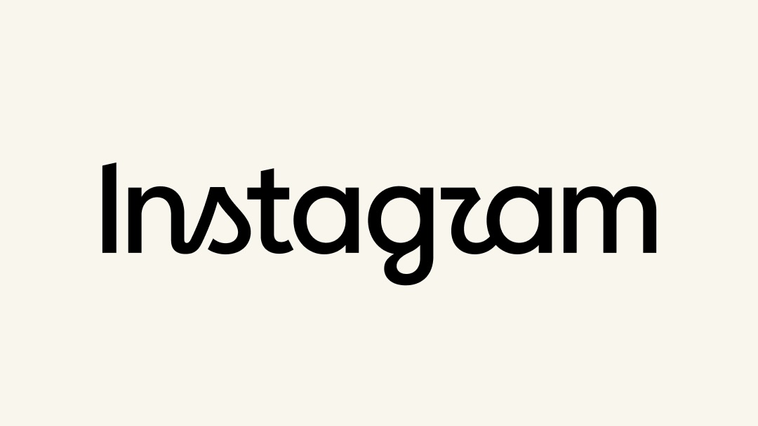
- Instagram has updated its wordmark, with the Head of Instagram describing it as 'leaner and more modern.'
- The author believes the new wordmark resembles the imperfect text generated by AI tools, citing issues with letter forms and spacing.
- Specific criticisms include the appearance of the 's' and the 'g,' and the overall legibility and identity problems of the text.
- The author posits that the flawed design could be an unintentional representation of the current AI-driven content landscape.